


When this was happening more and more often, it became obvious that it was time to create a solution that could scale into the future and would be understandable for every designer, user, and anyone using our application. This led us to start building our Soul Design System, which would force us to impose a systematic approach to how we solve problems, from the biggest issues to the smallest parts of the UI.

As a member of the DesignOps team, my role involves building and advocating for the design system, but also making sure every detail is functional. Most recently, my focus was on a small but extremely important part of our UI: badges. And that’s what this article is going to be about.
Similar to labels, badges are visual differentiators that indicate the state of a given process and call the user’s attention to important information about a piece of content. We had been using them for a long time on our CRM/social media management platform, but now that we had a design system and a growing platform, it was time to revisit them.
Our starting point
Our users are usually customer service agents or social media managers who use different apps in our platform to connect with customers. If, for example, a customer leaves a really angry message on a company Facebook page, the customer service agent or social media manager would be able to see the comment via our platform as a card with a status badge “Negative” and/or “High priority”.
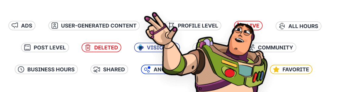
For a long time, the badges we used were 12x12 pixels with fully rounded corners that used text and icons to deliver the information. As we were redoing our badges to add them to our design system, I had the opportunity to redesign the whole set from a more strategic point of view.
(Un)sustainability and icons
Have you ever heard the expression “If you learn to fix the office coffee machine, you’ll never get fired”? The point is that when you do things in a team/company that nobody else can, you become indispensable. It means that your employers will feel compelled to keep you around, no matter how unproductive of an employee you may be. This, of course, is unsustainable.
When we faced a similar issue with our badges: the biggest factor dragging them down was that they were icon-heavy. Every single badge contained an icon in addition to text. Originally, when we had fewer apps and fewer badges, including icons made sense. But now, we had icons everywhere, and they were taking up space.
The other issue that came up regarding icons was that we had released a new set of icons into our app that we created manually. While the set is truly awesome, the default size of the 500+ new icons is medium (18x18 pixels), with only a select few including variations of a small of 12x12 pixels. Meanwhile, badges are small for a reason: we can’t overwhelm the UI with visual smog and therefore every pixel counts. So we have small badges, while the majority of icons are larger. What now?
Sure, we could rebuild every single new icon into a small 12x12 variant to replace our old badges, but this would be highway to hell, and totally unsustainable. Imagine trying to fit a football team onto a hockey field.

After some discussion, we agreed that it makes sense to use icons only in the most necessary cases, and that icons must then look distinguishable even in this small size.
Creating a category system
Speaking of sustainability, now that we had a design system to build, I wanted to be as strategic as possible when it came to rethinking badges. The first step was to categorize the different use cases for each badge. I ended up splitting them into three main categories: Status, Non-actionable, and Special.
Status
All the statuses we have in the application fall into this category of badges. I have created here 6 more subcategories which are then easily distinguishable in our library, so you can logically find what you are looking for:
New — Indicates new incoming messages (e.g. new posts, direct messages, comments, etc.)
Active — Indicates an active state, for example, when a message is Open or Running.
Incomplete — Indicates that a given task has not yet been completed. For example, when the user has scheduled a post without publishing it, or moved the item state to In progress.
Danger — Indicates that something is wrong, for example, Spam or Error.
Success — Indicates a successful, completed, or desirable state, such as a case that has been closed (Done) or that a message has been successfully sent.
Common — You probably want to use this one unless you fall into a specific use case.
Non-actionable
The non-actionable badge category displays information about the content below it. It is focused more on content than status. We do not use leading icons for information badges in any case.
Special
We also have a category of “special” badges that have been designed for a specific problem, for example, to designate priority levels, customer sentiment, and other product-related information.
Designing the new badges

First, I got rid of the fully rounded corners and opted for 6px rounded corners from our design system. This way, I also saved a few pixels in width, allowing the inner text to be closer to the edges. This was not possible before because of the visual alignment of the icons within the fully rounded corners, as the padding had to be bigger so it wouldn’t look compressed. With this new change, even when multiple badges are stacked together they looks more like a unit and are more scannable to the eye.
Another major change I made was separating the color coding of the created main categories. For the status and pre-created special badge sets, I went the way of a light background with a strong stroke and a high-contrast font inside, while non-actionable badges have only a white background. The special category includes promotional badges which we want to be the most distinctive and therefore have a solid background color.

Researching color codes (over and over again)
Once the categories, shapes and styles of the new badges were settled, I focused my attention on color coding strategy. Color was an important part of the badge anatomy, as ideally, users should be able to scan the colors alone to immediately understand the status of the message, making the time-sensitive job of a customer agent or social media manager that much easier.
We had many debates in the design team about what colors should be used for which status badge. But I didn’t want to leave anything up to the individual, so I decided to create a series of user tests to inform the final decision.
The user tests were primarily focused on the status category, as it was important for me to understand how users perceived the color coding of the badges.
First, a preference test
53 Participants (28 Emplifi - 25 from Usabilityhub panel)
First, I created a pure preference test where statuses were placed in a row and users were asked to assign the colors they found most fitting to each one. But I soon realized that this solution wasn’t really suitable because of one crucial spice I forgot to add: context. This was my mistake, so I ran a second test to fix it.

Adding context to the mix
42 Participants (17 Emplifi - 25 from Usabilityhub panel)
For adding context, maze.co came to my rescue, as this platform makes it possible to monitor and measure changes in interactive components. For interest, here is a prototype which we then shared at the end of the third test (but we will talk about it later). The test consisted of 6 cards and the user was invited to assign a status to a given card from a list. I then manually analyzed these results and created a table which I could then break down further.

Internal testing sessions
With user data, my badge system was coming together. But I didn’t stop there. To be extra sure of the direction, I reached out to our amazing UX Research team. I prepared a prototype for them and set up a Zoom call to show them the current state of our application along with my suggested changes. We discussed which directions they thought could be better, as well as their general views and suggestions. Here it was nice to have an insider’s view who knows our application like the back of their hand. At the end of the user test, I also had them fill out a context test and collect even more data.
Here are just some of the results I got from these testing sessions:
Maybe some animation during the “Running” would help, to give a sense of progression
Psychologically, most users will view amber/orange as a universal “wait” color, similar to traffic lights
To the status badge done add a check icon
Make the draft status as yellow as in progress. It’s the same category — a reference to the traffic light logic. But after seeing the context, it seemed natural to have the running status blue.
With plenty of data under my belt, I was now confident about which way to go with color strategy, which meant it was finally time to release the new badges system into the world.

The final frontier
We are now in the phase of slowly implementing the new badge system into our library and replacing the previous badges with new ones. It will take a little more time but we take it as an investment for the future.
Of course, not everyone will benefit from following the path I’ve described above. It is simply the solution that best suits our needs at this time, and I hope I could help and inspire someone to create and revitalize the design system in this direction.
Just one more thing before I go…
A final tip about Figma libraries
If you ever find yourself in a situation like me where you have some existing version of an element already applied in the library and you want to keep it linked, I would like to share my experience.

In the library, I found the element in question–in our case, the badge–and added its variant to the component. Next, I inserted our new badge variant inside, delete the old one and renamed the whole component as needed. This preserved the path while changing its content.
It’s nothing groundbreaking but it could save you a lot of time.